Saturday, 30 October 2010
Magazine Conventions
Below is a slideshow showing Magazine Conventions the first is more like a poster unlike the second.
Thursday, 21 October 2010
Professional Photography Ideas
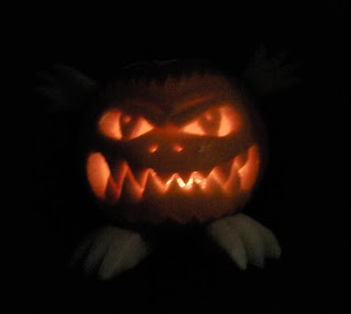
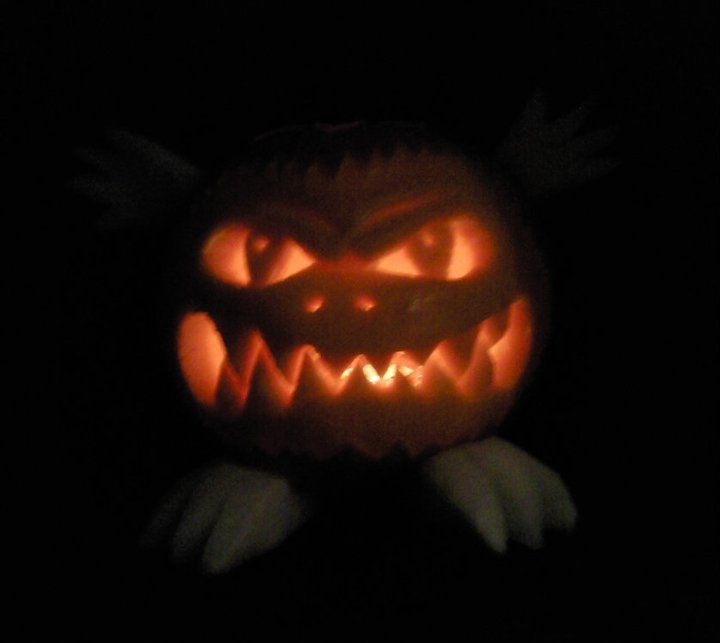
I took many photo's to contribute towards my college magazine (halloween issue) front cover and contents page however these are the ones that dint make the cut: -
Potential Front covers


Potential Contents Pages


College Magazine research
As another practice task we were told to come up with a college magazine front cover and contenst page in our media class - this was to help with our own magazines when we came to do them.
firstly we looked at examples of previous students' work:
Secondly we looked at example contents pages to work from...
firstly we looked at examples of previous students' work:
 |
| this magazine look a lot more indie then most and may appeal to students that tend to like that genre of style and music. |
 |
| This one brings in to context the idea of the paparazzi and could suggest that college is a place where how you present yourself really matters, therefore to be blunt I think this magazine would appeal to the more materialistic females & hetrosexual males. |
 |
| Due to the colour scheme in this magazine cover it may make people think that it is about preserving nature and -"going green". |
 |
| This contents page is fairly basic and looks like it'd appear in a magazine about education and careers. |
 |
| This contentx page is a lot more fun and funky in comparison to the first, this may appeal to the more laid-back students. |
 |
| I like this contents page because it is landscape which makes it a little different but I also like it because the image of the girl could be a student and she seems worried so this magazine may be about the struggles of keeping up with work and meeting deadlines at college, therefore giving students tips on how to manage college life. And Finally we produced our own college magazine cover and contents page - Here is the one I produced....   Like my Front cover I used the same techniques on my contents page, I liked the stroke blending option for texts and outlining images.Also i used a filter on one of my images to give a more spooky effect. I used a gradient effect along with the stroke effect for this masthead because I found the change in colour, through the gradient interesting. I have tried to entice customers (college students) with the cheap price and the well established college surroundings. I aslo used halloween associated colours as well to fit in with the theme of the edition. The backround pictures were took at night for a more horrific effect also a flash light was used on the models face on the front cover to make it look more scary. |
Practice using Photoshop
In our media class we were given the task of producing a basic perfume asvertisemnet so that we could familiarise ourselves with photoshop, this is the ad that I came up with...
 |
| I found the images for this ad individually, for instance firstly I picked out a background image then a perfume bottle and finally a model ( Jennifer Lopez) I used the eraser tool around both the perfume bottle and model so that there was no white space. I added in the Text with the Text tool on Photoshop. |
I do think There is room for improvementi with this advertisement however for a first attempt I am fairly happy with the out-come and think the more i use photoshop the better I will get at it.
Thursday, 14 October 2010
Questionnaire & conclusion:
I conducted a questionnaire for college students concerning a college magazine and there background views on life. They were aged from 16-18 years old. I questioned 5 boys and 5 girls.


From the results I can tell, by key question 2 that most students’ parents are from the social grades of C1 and C2 as many are skilled manual workers or Supervisory, clerical, junior managerial, admin or professionals.
Also Key question 10 demonstrates the two step flow theory as we can establish who the opinion leaders are in certain social groups depending on what their friends think of them. For instance one response I received was “legend” therefore by this we could say that, that person would be the leader of the group.
Key question 12 shows the needs and gratifications of the students as they pick from a closed question what they would most like to see in a college magazine. The majority picked music.
Finally key question 13 shows the reception theory as it shows that many TV programmes (in this case) are not passively accepted by the audience and they like to choose what they watch for certain reasons, whether it be to relate to reality or simply watching for humour. The reader/viewer interprets the meanings of texts (TV) based on their individual cultural background and life experiences.
Tuesday, 12 October 2010
Photography Task:
In the lesson we went out with camera's to take photographs to show certain photographical skills that we could possibly emalgamate into our college magazine.
When we begin our college magazines we will use the skills we've learned to help achieve the perfect front cover and contents page photos. Here are my experimental images:
 |
| The above image demonstrates a high shot angle, also the hat is used as a prop to show student trends. |
 |
| The above image shows a perspective shot type and depth of field as the objects in view is the "so called tiny" person that is being helled by the giant hand. |
 |
| This is also an angle shot from a low perspective. The shot distance is very close up as we can see inside the radiator. |
 |
| This shot was done using a macro lense. |
 |
| This image shows juxtaposition as the black and white outfits contrast. |
 |
| This image is a medium close up and shows an idirect mode of address as the person is looking away from the camera, the pose can also suggest an inviting connotation. |
 |
| This however is a direct mode of address as the person is looking directly at the camera lense also the pose suggests a punk.rocker background. The setting is the music room which also adds to the punk/rocker image. |
 |
| The rule of thirds is demonstrated here as the person is in the left third of the photo, therefore it could be said that there is an imbalance in this picture. |
 |
| The proxemics of this image shows that the girl in the leather jacket acknowledged the camera and posed, as did the girl behind her however because of the composition of this everything in the bacground was also captured |
I will go on to use these techniques when considering my magazine front cover and contents page.
Subscribe to:
Posts (Atom)